Poster Walls 101: How to Create an Aesthetic Gallery Wall Without Damaging Your Walls
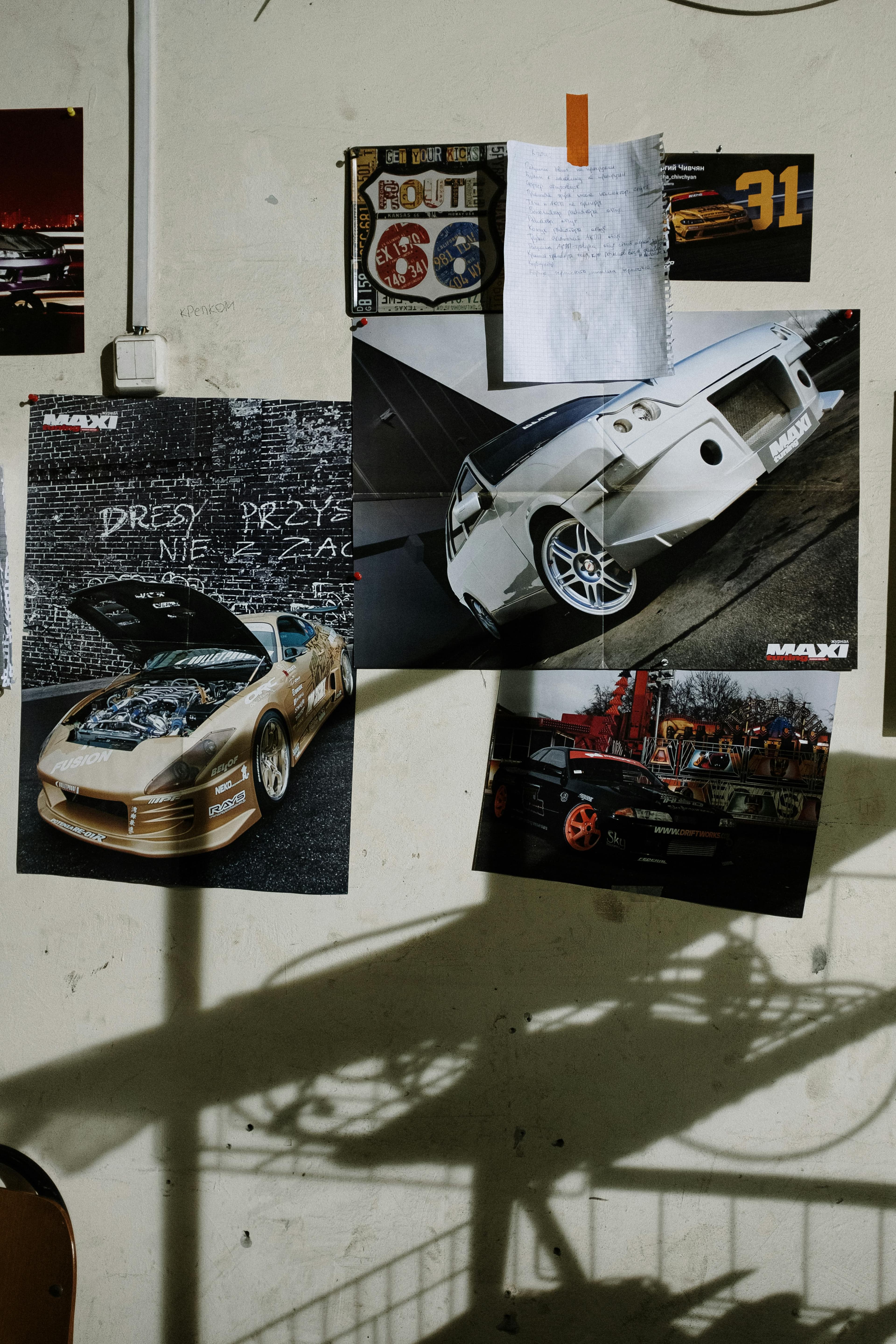
Every Pinterest board lied to you.
They show these immaculate gallery walls with perfect spacing and gorgeous frames, but they never mention the seventeen nail holes hidden behind each frame. Or the $400 in custom framing. Or the fact that some of us live in rentals where a single thumbtack means goodbye security deposit.
Here's the truth: you can create a stunning poster wall without owning your space, without spending a fortune, and without putting a single hole in your wall.
Let me show you how.
Damage-Free Hanging Methods (Ranked by a Renter)
I've tested them all. Here's what actually works:
🥇 Command Strips — The Gold Standard
Best for: Most situations. Seriously, these changed my life.
The trick everyone gets wrong: you need way more strips than you think. A medium poster? Four strips minimum. Large poster? Six to eight. And when you remove them, pull straight down (not out) for clean removal.
Pro tip: Wait 1 hour after applying before hanging anything heavy. The adhesive needs time to cure.
🥈 Poster Putty — The Flexible Friend
Best for: Lighter prints, temporary displays, textured walls
Roll it into small balls, press onto each corner, stick to wall. Invisible from the front. Reusable. Doesn't leave marks on most surfaces.
Warning: Not strong enough for heavy paper or frames. Your poster might slowly slide down the wall over weeks. Ask me how I know.
🥉 Washi Tape — The Aesthetic Choice
Best for: When you want the hanging method to be visible
This isn't about hiding your tape—it's about making it part of the design. Colorful borders. X-marks in corners. Grid patterns. Washi tape turns "I'm renting" into "I'm stylish."
The vibe: Casual, creative, easily swappable.
Magnetic Poster Hangers — The Elevated Option
Best for: Making posters look expensive without frames
Two wooden or acrylic bars that clamp the top and bottom of your poster with magnets. Hang from a single Command hook. Suddenly your $15 poster looks like gallery art.
Why I love them: Zero adhesive touches the poster itself. Perfect for prints you want to keep pristine.
Clipboards & Clothespins on String — The DIY Gallery
Best for: People who change their displays constantly
String some wire or twine across your wall. Clip posters and photos with clothespins. Instant gallery that you can update in seconds without any wall damage.
The vibe: Creative studio, Pinterest dream board IRL.
The Paper Template Trick (This One's Important)
Here's the interior designer secret that saves hours of frustration:
- Trace each poster onto newspaper, craft paper, or printer paper taped together
- Cut out the shapes
- Tape the paper templates to your wall using painter's tape
- Rearrange obsessively until it feels right
- Take photos. Sleep on it. Look with fresh eyes tomorrow.
- Mark the corners lightly with pencil
- Remove templates, hang real posters in their place
This sounds like extra work. It's actually less work because you won't be re-hanging the same poster six times.
Gallery Wall Layouts That Actually Work
The Grid — For Type-A Energy
Equal sizes, equal spacing, perfectly aligned rows and columns. Clean, modern, satisfying.
The key: Measure obsessively. Use a level (your phone has one). Keep gaps consistent—2 to 3 inches works best.
Looks best with: Matching frames or similar poster sizes.
Salon Style — For Creative Chaos
Different sizes clustered organically. The classic "gallery" look you see in museums and fancy hotels.
The key: Start with your largest piece slightly off-center. Build outward, balancing visual weight (a cluster of small pieces can balance one large piece). Keep spacing relatively even—1 to 2 inches between everything.
Looks best with: Mixed sizes, mixed frames, maximum personality.
The Statement Piece — For Minimalists
One large poster, perfectly placed, surrounded by intentional empty space.
The key: Center it at eye level (about 57 inches from floor to center—this is the museum standard). Let it breathe. Resist the urge to add "just one more thing."
Looks best when: The poster is bold enough to stand alone.
The Horizontal Line — For Long Walls
Multiple posters arranged in a single horizontal row. Perfect above a couch, bed, or long hallway.
The key: Keep the centers aligned, even if sizes vary. Use a string stretched across the wall as a guide.
The Asymmetrical Stack — For That Effortless Look
Different sizes arranged in a loose vertical or diagonal cluster. Looks casual but intentional.
The key: Overlap edges slightly or let posters almost-but-not-quite touch. Step back constantly to check balance.
The Numbers That Matter
- Eye level is 57 inches from the floor to the center of your arrangement (not the top)
- Spacing between pieces: 2-3 inches for grids, 1.5-2 inches for salon style
- Above furniture: Your gallery should be about ⅔ the width of the furniture below
- Bottom of art above a sofa: 6-8 inches above the back of the couch
These aren't rules. They're starting points. Trust your eye, too.
Room-by-Room Inspiration
Bedroom (above the bed): Go calming. Nature scenes, soft colors, meaningful quotes. This is the last thing you see before sleep and the first thing you see waking up. Make it peaceful.
Living Room (above the sofa): Go bold. This is your statement wall. Conversation starters. Things that make guests ask "where did you get that?"
Home Office: Go motivational. Surround yourself with images that fuel your work. Inspiration boards, goal reminders, artwork that makes you feel creative.
Dorm Room: Go maximalist. You have four walls and one year. Cover them with personality. This is the time to experiment.
Common Mistakes (And How to Fix Them)
Hanging too high — Everyone does this. Art isn't meant to be looked up at. Bring it down to eye level. Yes, lower than you think.
Identical spacing obsession — In salon-style arrangements, slightly varied spacing actually looks more natural than robotic precision.
Forgetting about the room — Your gallery wall doesn't exist in a vacuum. Consider the furniture, the lighting, the other walls. Balance the whole space.
Over-matching — Everything in matching black frames looks... boring. Mix materials. Mix sizes. Let things be a little imperfect.
Going too small — One tiny poster on a big wall looks like a postage stamp. Go bigger than you think, or cluster smaller pieces together.
Find Your Walls' Potential
The best poster walls tell a story about who you are and what you love. They evolve over time. They're never truly "finished"—and that's the point.
Start with a few pieces you genuinely love. Hang them imperfectly. Add more as you find them. Let your walls grow with you.
Looking for prints that speak to you? Explore Sticksy's poster collection or upload your own photography and art to create something no one else has.
Your walls are waiting. What will they say? 🖼️